

First add in a multipart nationally televised and web marketed ad series that introduces the Trellix brand and it’s products with a focus on XDR. XDR enables SecOps teams to breathe easier. The ad demonstrates built-in cyber intelligence and defensive playbooks, so organization can always stay one step ahead of attacks, including ransomware.
The team spearheaded the three part series’ product of motion graphics, creative direction and brand guidance for all Trellix product placement.

The second part of the Trellix ‘Cybersecurity with Less Stress’ Series. The focus was on helping SecOps relax—even in the face of attacks. The add demonstrates the XDR Platform which unifies security solutions making it easier to prioritize alerts and respond to threats.
Given my longstanding experience with motion graphics production in Adobe After Effects I educated and directed my to replace product navigation and walkthroughs leveraging exported Muse Figma components.

The last in the ‘Cybersecurity with less stress’ series. The Pottery Workshop demonstrates once again the ability to simplify and strengthen security—and ease the strain on SecOps that is powered by data science and enhanced by machine learning.

NOTE: CLICK ‘+’ BUTTON IN THE UPPER RIGHT CORNER TO EXPAND
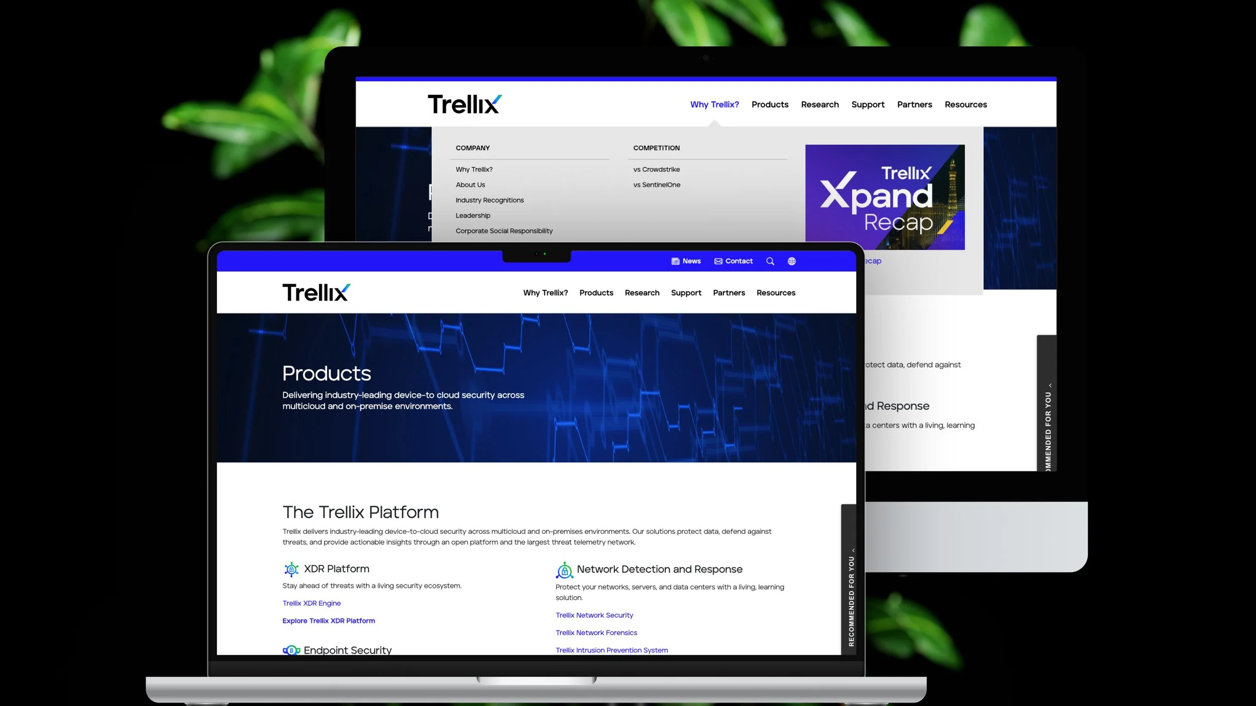
Along with the partnership with the brand and marketing team early on with the launch of Trellix, my team took an even deeper support role in creating the Trellix website. Given the distinct needs of applications versus websites, I directed the team to leverage the Muse Design System on a subtle and foundational guidelines level - i.e., grid, color, and typography token usage.

NOTE: CLICK ‘+’ BUTTON IN THE UPPER RIGHT CORNER TO EXPAND
While we considered the usage of Muse components, in close collaboration with Creative Director I made the decision to not leverage the Muse component library and instead use this as an opportunity to explore a new variant of Muse tailored to consumer websites.

NOTE: CLICK ‘+’ BUTTON IN THE UPPER RIGHT CORNER TO EXPAND
The usage of Muse design tokens provided endless flexibility in application to structural or basic elements for Trellix.com website. While not ‘must have’ requirement for the website, the adapted Muse color variables was easily able to meet AA WCAG accessibility score given the rigor applied to the product’s color pallet.

NOTE: CLICK ‘+’ BUTTON IN THE UPPER RIGHT CORNER TO EXPAND
The Muse grid tokens were a expanded to create negative space for a more relaxed a scan-able style to cater to potential customers instead a product user. Thankfully the minor modifications to base spacing did not break the responsive behavior established in the design system.

NOTE: CLICK ‘+’ BUTTON IN THE UPPER RIGHT CORNER TO EXPAND
Tailored specifically for upcoming Trellix.com initiatives, I executed a rapid delivery plan to create a set of reusable .com only Muse components. In this case the Trellix Top Navigation and CTA components.

NOTE: CLICK ‘+’ BUTTON IN THE UPPER RIGHT CORNER TO EXPAND
To quickly populate page development, above demonstrates the Hero and Feature components.

NOTE: CLICK ‘+’ BUTTON IN THE UPPER RIGHT CORNER TO EXPAND
Above is an example of the 3 slot content showcase component.

Tailored specifically for monthly threat reports we supported a .com dark theme and carousel component.

NOTE: CLICK ‘+’ BUTTON IN THE UPPER RIGHT CORNER TO EXPAND
Given the different context of the Support Portal, we leveraged the traditional Muse grid structure.
