






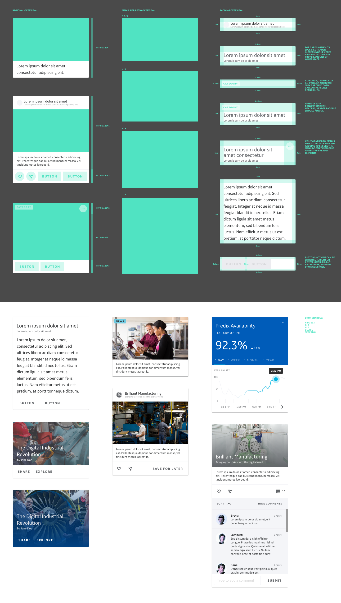




From the beginning, Core was established to be a design system that applied equal importance to designer and developer alike. By doing this, developer are able to speak the same language which in turn improves efficiency and working relationships across teams. The system is hinged upon the use of EM's instead of pixel counts and a flex grid based on percentages instead of columns.

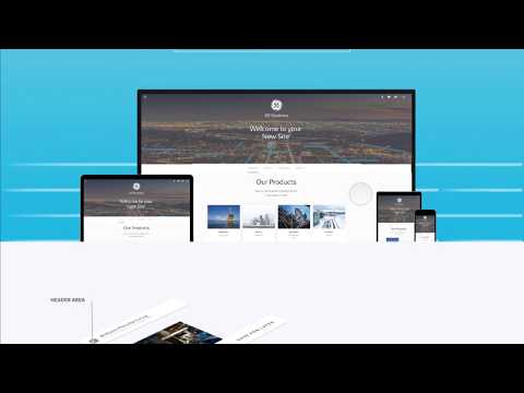
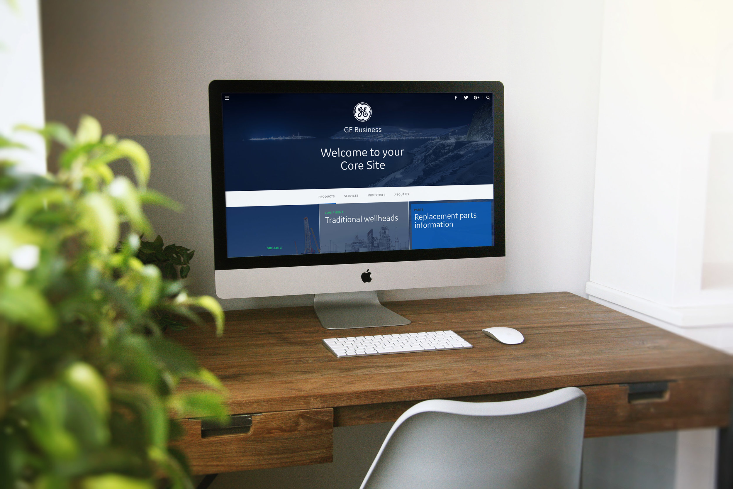
This video gives a brief walkthrough of the Core Design front door site. One point to note, the site also serves as a means to delineate itself from the other design language at GE - The Predix Design System. Core serves as the visual structure for all non industrial use cases within the company.

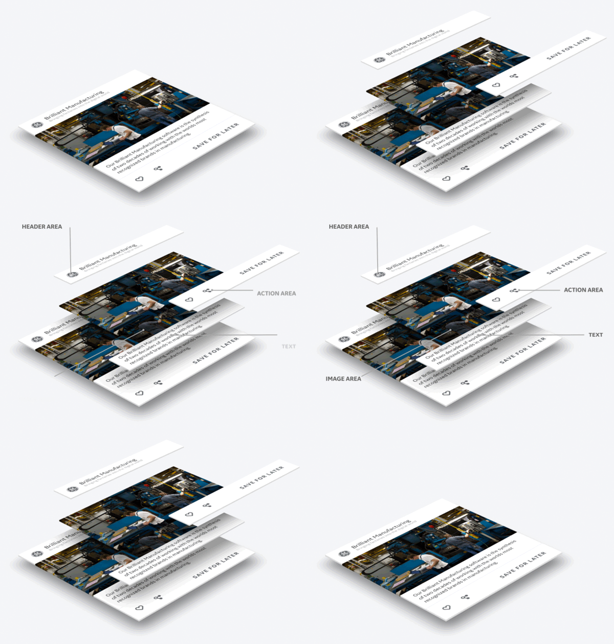
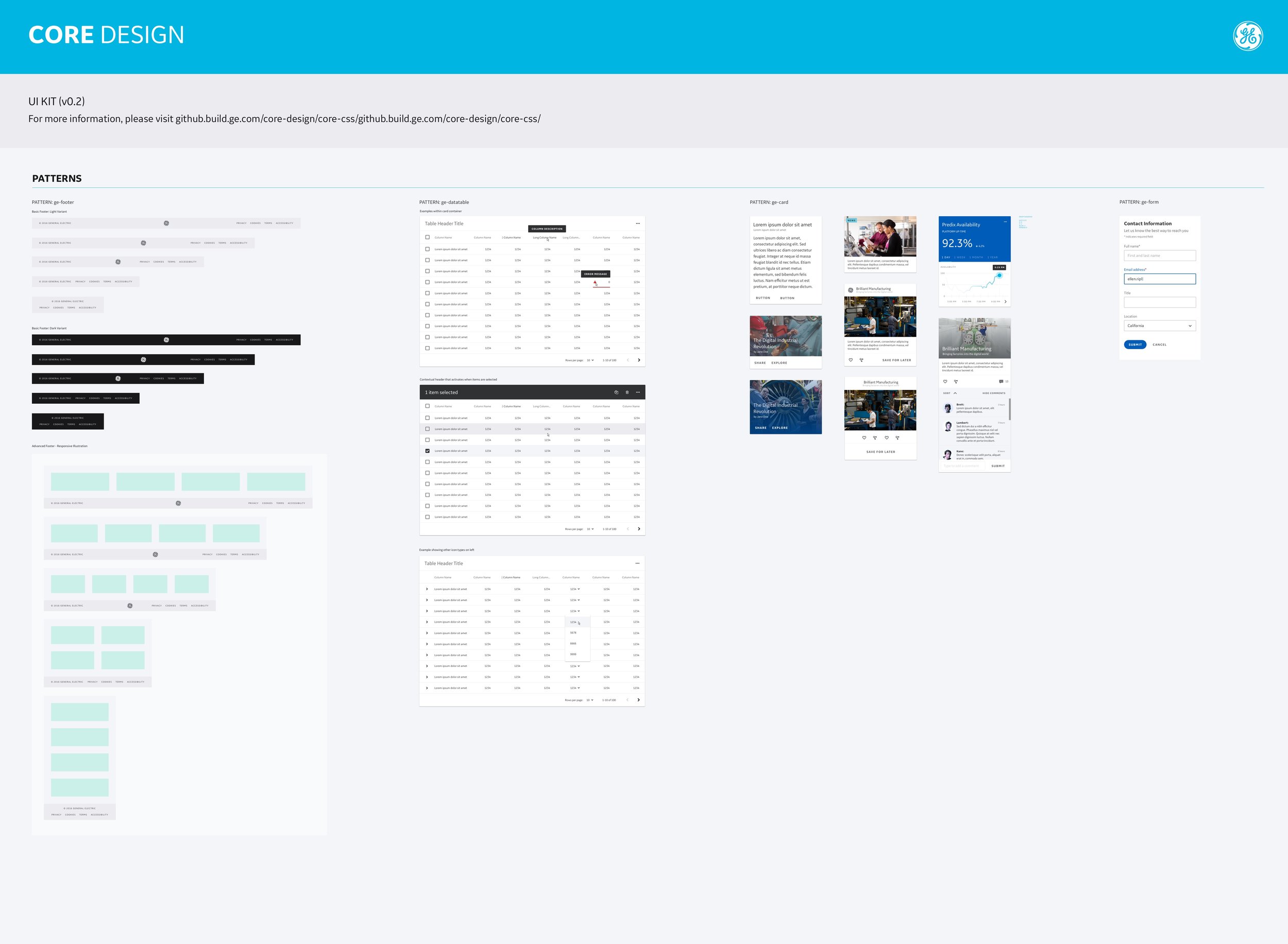
This animation illustrates the modular components that leverage to create a pattern, in this case a card. Patterns are groupings of components like navigation, footers, form, block elements and tables.

Brand fonts, colors, and base components are at the heart of Core Design. From the beginning the design and development teams worked cohesively to create elements fully realized in code.

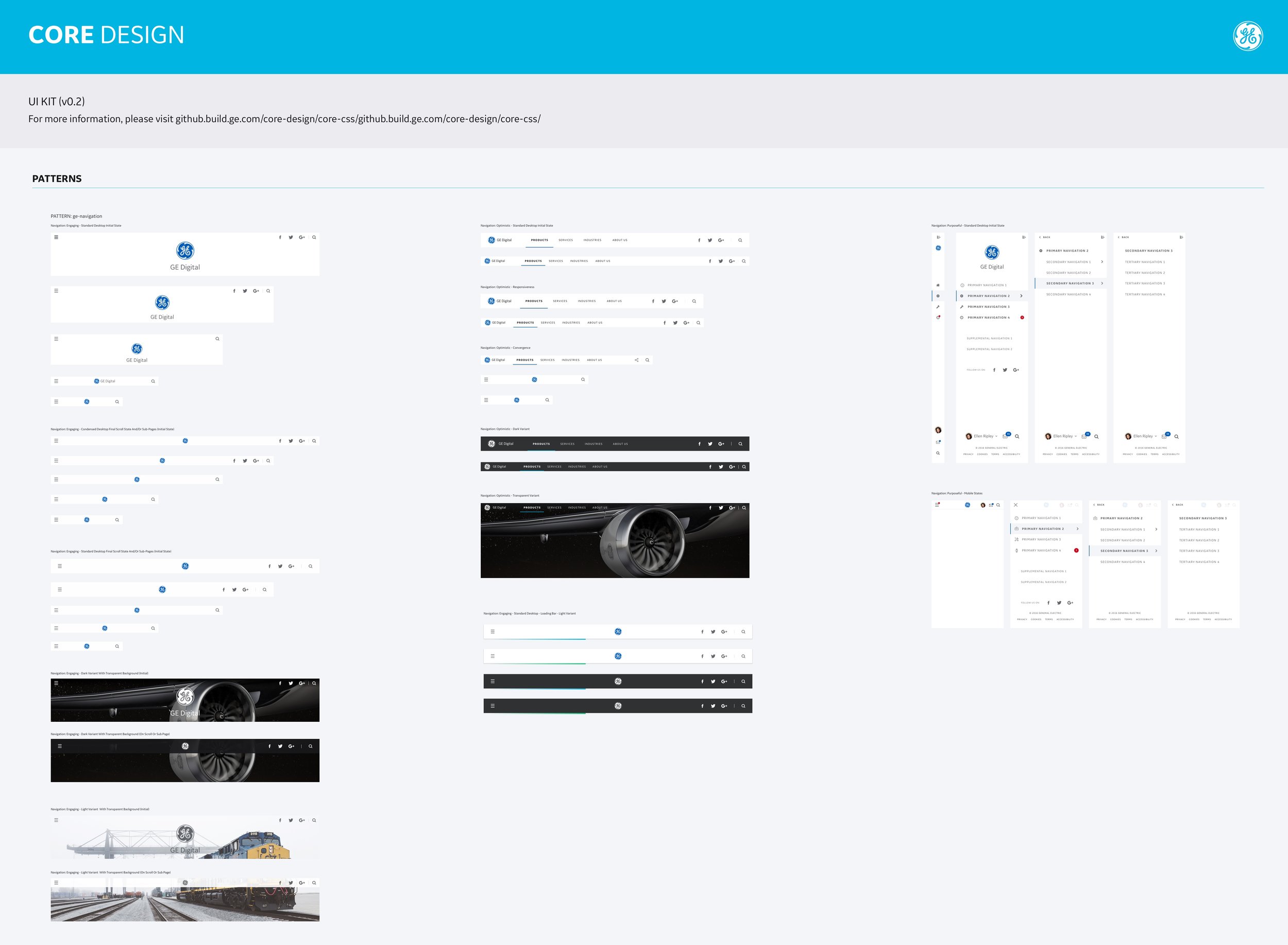
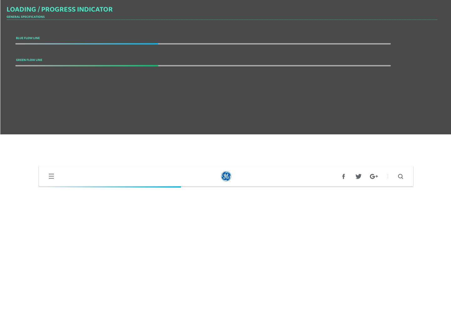
Global elements like navigation we the first major paradigm shift that I drove the team to establish first using the establish Core, color, font and components. As simple as it, defining a universal navigational system for the company was a major win.

Along with the base UI kit we provided developed and a fully editable Sketch file that leverages base Core components, typography, master brand colors, and imagery.

A simple manufacturing shop floor application reference design, it leverages a purposeful navigation paradigm and flexible table structure to monitor digital assets.

Our digital industrial application ecosystem is of equal importance to amplifying the new digital industrial company culture of GE. A blog or editorial based website reference design has become highly successful in terms of reuse.

To launch any successful product one needs to rapidly amplify it immediately to continue the GE Fastworks principles. This design provides a designer and in turn a developer to create a home for their growing application.

Responsive is at the heart of the flex grid is the scaffolding to all reference designs.

This next evolution of the design system implements many full screen navigational structures that dovetail well with large format TV or recline experiences.
